Graphics for you: Common Brill Sections

Here are a few brill graphics that you can use on your brills. These cover the basic sections that most brill are expected to have.

Why Brill

The most important part – why the thing isBrill.com. You don’t have to call it Why Brill, that’s just always been the internal name.

Brill links (normal and silly spellings)

Your brill links are a list of related things that people who agree the thing is brill will want to look at.


Brill list

A brill list is a list of things. Maybe a list of famous users, a list of reasons why the thing isBrill.com, or just some other list that fits really well.


Brill license for off-site use

This media by Matt is licensed under CC BY-SA 4.0

3 Examples of brill customisation done well

If you know enough CSS you can make your brill look like almost anything. However, a good brill should still look like it is part of isBrill. Here are some example customisations that work well.

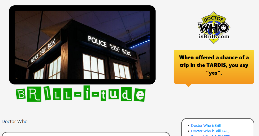
Doctor Who isBrill.com

The Doctor who brill takes on the hardest of tasks, reimagining the iconic brill sign to fit the topic. While 99% of the time, I would say this is a bad idea, this example just works.

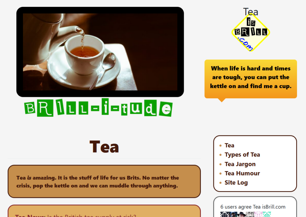
Tea isBrill.com

The tea brill takes a more subtle approach to customisation by quietly reworking some of the colours and text sizes. What in most cases is a weak page header has become a thematically coloured strong header.

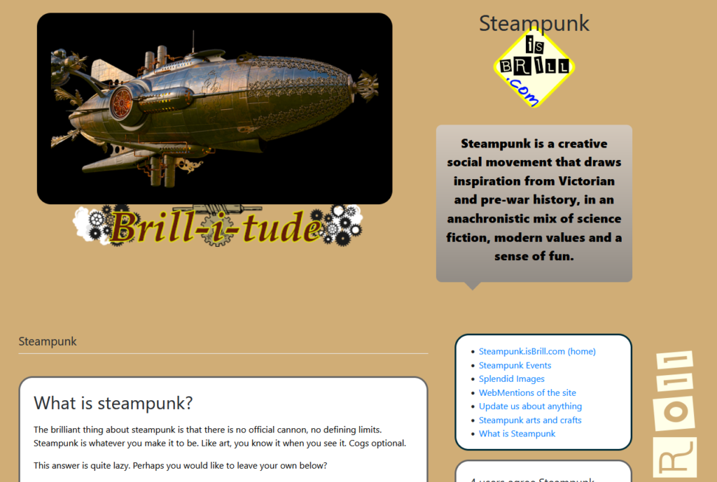
Steampunk isBrill.com

The steampunk brill makes the most of background colour to really bring out the subtle brill-roll image but replaces the Brill-i-tude with a steampunk reimagining. With just a few tactical colour changes, this brill manages to feel very different without really changing very much.